
[ PROJECT OVERVIEW ]
The Friends of the Domes, the non-profit organization managing the operations of Milwaukee’s Mitchell Park Horticultural Conservatory (The Domes), embarked on a comprehensive rebranding initiative to better reflect its evolved management role and to significantly expand its impact and influence within the community. This strategic effort culminated in a new name and complete brand identity: the Milwaukee Domes Alliance.
[ THE CHALLENGE ]
This led to a desire to simplify the organization’s identity, minimize public confusion regarding its relationship with the Domes landmark and Mitchell Park, and revitalize the brand to attract a wider audience. To prepare for a major capital campaign for the Domes’ rehabilitation and restoration, the organization aimed to reposition itself as a premier urban destination with a world-class visitor experience. This strategic move was designed to ignite community engagement and boost admissions, membership, donations, and overall participation.
[ THE SOLUTION ]
Conducting a brand audit and analysis, reviewing historical branding, donor and community surveys, and performing key stakeholder interviews to understand current perceptions and desired brand positioning.
Facilitating a messaging session to develop a comprehensive brand narrative platform. This included defining the organization’s mission, vision, values, unique selling proposition, brand voice, and key messages for various audiences.
[ The Milwaukee Domes Alliance Brand Story ]
Guiding a core working group of stakeholders, conducting surveys, and going through presentation and revision rounds to identify and finalize a new name, Milwaukee Domes Alliance.
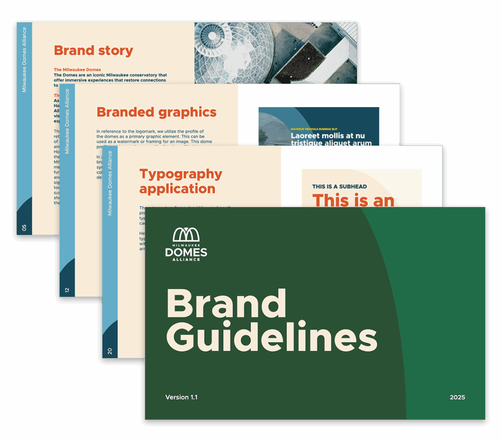
Researching, concepting, developing, and finalizing a new visual identity. This included creating a new logo system, defining a color palette, selecting typography, and developing how the new visual brand would be applied to and extended across touchpoints. The process was iterative, with revision rounds to ensure the final visuals aligned with the new brand narrative.
Developing strategies for the public rollout of the new brand, including key stakeholder communications, media relations, video development, and digital advertising.

[ THE RESULTS ]
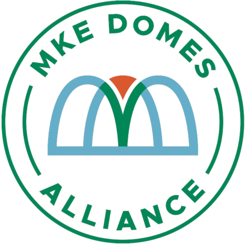
The new brand highlighted the iconic conservatory that offers immersive experiences that restore connections to nature and our community. The logomark utilizes the profile of the domes as a primary graphic element.
Additionally, the brand pattern is a repeating tile of the person/flower symbol from the center of the logomark. This pattern has three different color variations corresponding to the show dome, desert dome and tropical dome.
This cohesive and symbolic new identity positions the Milwaukee Domes Alliance to effectively inspire meaningful connections to nature and community for generations to come.

[ WE’RE HERE TO HELP ]
Click the button below to get in touch with a member of our team.